
hey ho! let's go!
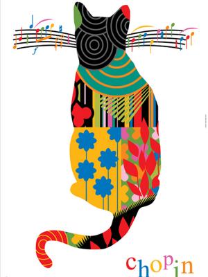
andrew lewis on poster art
andrew, I’d like to welcome you to powder. we are dedicated graphic arts fans here, so to speak with someone of your talent and achievement is truly a pleasure.
Thank you so much powder!
so firstly, i’d like to ask what you are working on right now and what projects you have coming up in the future?
I am really excited about this new year and the new direction my studio is taking. After many years of designing and being an under payed therapist for clients, we are creating our own brand that will design/produce a wide range of products to sell in retail and online environments. Beyond the obvious (posters), I am looking at apparel, surf/skate boards to creating fine art for galleries!
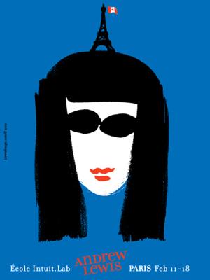
Presently, I am working on a major brand identity for the Government of Canada and Mexico for the 70th Anniversary of Bilateral Relations. This is very challenging and high profile project which will be launched the end of January 2014.
when you approach a new poster or project how do you gain your inspiration? what inspires you and once the inspiration comes what’s your design process?
That is a very difficult question for me actually. It may depend on what kind of poster I am working on and its functionality. There is a vast difference between a social/political comment poster than to a poster to promote shall we say Starbucks Coffee. The former needs to auger into one’s part of the brain that needs to think, react and intellectually analyse a serious cause. The other needs to tickle the part of the brain that houses the entertainment and fun zone to trigger the emotion of want/need/purchase.
Inspiration I think is a mix of having knowledge and thorough research on the poster subject before the design process and visualizing an atmosphere that will be unique. It is funny; some of the best posters I have designed just arrived out of the blue like FedEx dropping off an envelope stuffed with $100 bills couriered from an unknown sender. I can’t explain it.
what led you down the path to become a poster artist?
The edited story to that is while in second year art school I landed a job at a newspaper that had an art director with vision. It was a baptism by fire complete with real and very tight deadlines; I was 17 at the time. I worked every hour I could and took on extra work for vacationing designers and saved every penny. One day heading home, on a whim I bought a ticket to London, England and the school let me go with the premise I handed in a report on galleries. In London, I decided this wasn’t enough so I headed to Paris alone to see the city that had been entertaining my imagination for many years. And it was there by chance that I walked into a vintage poster shop selling original Belle Epoque posters by Jules Cheret, Lautrec, Cappiello etc and where I heard fireworks, choirs, angels, and The Ramones’ Blitzkrieg Bop go off in my head. POSTERS! It was THE moment…
when you were starting out and beginning poster art what are some of the posters produced by other artists that really stuck with you?
Thankfully, the art school I went to had an amazing collection of Swiss Graphis magazines which I devoured every page. They featured the best European designers and sometimes gems like Push Pin in New York or Alan Fletcher at Pentagram in London. To me, these poster artists had a mandate to create the most powerful and thought provoking images possible. The work of Grapus or any of the Polish designers was light years ahead of what was happening in N America and was (and still is) part of my creed in designing posters still to this day.
from the vast collection of posters you’ve produced, which ones would you say are most significant for you?
After attending the opening in 1993 (OMG… that long ago?!) of the Colorado International Invitational Poster Exhibition, where I met Xavier Bermudez of Mexico’s Poster Biennial, I returned home to Canada with a complete new understanding of the poster. I created a poster for Zyliss in Switzerland for their SUSI Garlic Press that then opened up all the doors internationally for me through poster biennials, publications and exhibitions. It was like having a 70x100cm business card! It was a monumental moment in my career and I have only one copy left!
which artist and designers have influenced you from the past and who takes your attention and inspires you on the scene today?
Past influences: Picasso, Matisse, Cappiello, AM Cassandre, Franz Kline, Litchenstein, Warhol and David Hockney.
Present influences: Lex Drewinsky, Francois Caspar, Cedomir Kostovic, Alejandro Magallanes, Germán Montalvo, and still David Hockney!
besides other artists what other cultural influences help to shape your work?
Travel! I am invited 4-5 times a year to travel to international poster biennials, exhibitions, universities to exhibit my posters, to teach workshops or be a Juror. Last year found me in Honolulu, Paris, Saint Etienne, London, Lima (Peru) and La Paz (Bolivia), talk about a buffet of cultural/visual mental injection! Also, students that I teach. They believe in the “Design Santa Claus” and it is Christmas Eve… in other words, they have a fresh enthusiasm that rubs off on me and really makes me rethink and re-evaluate how I work!
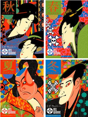
you’ve produced a series of japanese inspired posters. what were they all about?
This was part of a branding project for a new store called “Ms Winnie” in the Ginza shopping district of Toyko. The 4 images were used in ads, as well as instore and subway posters and depict/say “Spring, Summer, Autumn, Winter” in the upper left corners. Really, they were just big bright, fun images that payed homage to the Edo period along with current imagery.
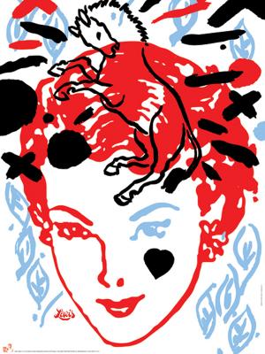
towards the end of twenty thirteen you were awarded a gold medal at a prestigious mexican design event. what was the medal specifically for and how did you feel receiving the award?
Ironically enough, after attending the Biennial in Mexico City for the past 13 years I could not make it due to a project in Vancouver. I won the Gold Medal but was home that night watching television at the time if you can believe it! Then my iPhone started to go off with texts from international friends saying “You Won!” Won what I wondered, then photos of the award came in from Mexico City and that was that. But, the most amazing news came after in that the Ambassador of Mexico was coming to Victoria, British Columbia to personally present this medal to me at the Parliament Buildings. It was a very serious and gracious presentation, one that I will remember forever. Rather incredible really, I felt like I finally had done something worthwhile with my work! The poster also won the Silver Medal recently at the International Poster Biennial of Bolivia.
your art has taken you around the globe. which destinations would you say were the most inspiring? what cities stay with you?
There are the cities but then there are the people that I know in those cities that have become such wonderful and meaningful friends. Guadalajara Mexico ranks top after the 2000 International Poster Biennial of Mexico and Conference. I have been back a dozen times on invitations to teach, to exhibit and also to visit the friends I made, the students that were my assistants are now adults, married and some with children. It was and still is a magical moment and city! And, I will always have Paris…
lastly, you’re from victoria in british columbia, canada. what’s life like living in victoria?
Firstly, Victoria is located on Vancouver Island off the west coast of British Columbia and the major city of Vancouver. They say it is more English that being in England, which in some ways could be true. It is a port city on the Pacific Ocean with a beautiful vibrant city centre complete with beautiful architecture and diverse pockets to explore. It is a relatively small city with a small population base on the Island (which by the way is just about the same size as England sans Wales and Scotland). There is a really good cultural and arts scene, with more and more young people creating new and cool things. 2013 we moved from a beach house to our present 1912 character home where I have a studio. My wiener dog Winifred keeps me company all day long and for me, it is just about the perfect place to return to after those insanely long trips to Europe or South America!
once again andrew, thank you so much for talking to us here at powder. we look forward to seeing the next vibrant series of posters you produce.
Well, thank you for your kind interest in my work!
check out andrew lewis design
instagram andrewlewisdesign#
friend andrew lewis design
poster! magazine andrew lewis